Interactive data visualizations
Data visualization is an important part of data science. In many cases, it is difficult to find a particular phenomenon only through calculation. Especially when using EDA method to analyze data, without good visualization skills, it is easy to come the wrong conclusion. The best example is ‘fMRI Statistical Maps’, every valuable Interpretation is obtained by visualization. From my view, there are two types of data visualization one is ‘static’, like using Matplotlib, Seaborn. Once python generates the plot, user cannot change it. And another one is ‘dynamic’, no matter the user or reader they can interact with the graphs. Interact figures help them find more valuable information beyond the figures.
So far, there are three popular interactive visualization Python packages: Altair, Bokeh, and Plotly. For the convenience of use, I will mainly introduce Bokeh and Plotly in following parts.
import numpy as np
import pandas as pd
import matplotlib.pyplot as plt
Read file and check it
This time I am not using pd.read_csv method instead input file from bokeh package directly. Therefore, you can download my notebook and run it in your own jupyter notebook.
For more details about the iris dataset, please refer background
from bokeh.sampledata.iris import flowers
flowers.head()
| sepal_length | sepal_width | petal_length | petal_width | species | |
|---|---|---|---|---|---|
| 0 | 5.1 | 3.5 | 1.4 | 0.2 | setosa |
| 1 | 4.9 | 3.0 | 1.4 | 0.2 | setosa |
| 2 | 4.7 | 3.2 | 1.3 | 0.2 | setosa |
| 3 | 4.6 | 3.1 | 1.5 | 0.2 | setosa |
| 4 | 5.0 | 3.6 | 1.4 | 0.2 | setosa |
print(flowers['species'].unique())
['setosa' 'versicolor' 'virginica']
flowers.info()
<class 'pandas.core.frame.DataFrame'>
RangeIndex: 150 entries, 0 to 149
Data columns (total 5 columns):
# Column Non-Null Count Dtype
--- ------ -------------- -----
0 sepal_length 150 non-null float64
1 sepal_width 150 non-null float64
2 petal_length 150 non-null float64
3 petal_width 150 non-null float64
4 species 150 non-null object
dtypes: float64(4), object(1)
memory usage: 6.0+ KB
Visualization with Bokeh
Unlike numpy or pandas, bokeh has kinds of different functions. We cannot import all in one time. Therefore, in next steps, we import package only we need it.
from bokeh.plotting import figure, show, output_notebook
from bokeh.sampledata.iris import flowers
output_notebook()
The above icon indicates we have successfully embedded Bokeh into our notebook. You may note the output_notebook parameter, this means to redirect the output (namely, the plot) to our notebook. You can change it to HTML (new browser tab) or any other you want. For redirect to HTML, I recommend you look through the data camp course: ‘Interactive Data Visualization with Bokeh’. I have finished this course, very useful for interactive data visualization, highly recommend.
It should be noted that the data frame cannot pass to bokeh directly, bokeh accepts ‘Column data source’ commonly. (String column names corresponding to the data)
# Here is Column data source
from bokeh.models import ColumnDataSource
source = ColumnDataSource(data={ 'x':[1, 2, 3, 4, 5], 'y':[8, 6, 5, 2, 3]})
source.data
{'x': [1, 2, 3, 4, 5], 'y': [8, 6, 5, 2, 3]}
The other thing is that bokeh output is ‘glyphs’ rather than ‘figures’, strictly. Glyphs include data, visual shapes (like circles, lines, squares etc.) and properties of this glyph (size, colour, transparency). Let’s forget the above official definition. I will say glyphs is ‘canvas’, you can use any colour pencil to draw. But the important thing is, when we need new ‘glyphs’, we need new paper, plot = figure (). Otherwise, our work is like graffiti, disorganized. Of course, it’s a great way to create graffiti.
First, we just plot the iris data and see what happens
Glyphs
plot = figure (x_axis_label = 'patal_length', y_axis_label = 'sepal_length')
plot.circle(flowers['petal_length'],flowers['sepal_length'])
show(plot)
You can see that there are some buttons on the side, and try to interact with the ‘glyphs’
This is my graffiti
x = [3,5,0,5]
y = [2,0,2,0]
plot.line(x,y,line_width = 3)
plot.circle(x,y,fill_color = 'yellow',size = 10)
show(plot)
You see, all figures put one ‘glyphs’ because I am not clean the ‘paper’. plot = figure()
We need to reload the plot for the following steps
plot = figure (x_axis_label = 'patal_length', y_axis_label = 'sepal_length')
plot.circle(flowers['petal_length'],flowers['sepal_length'])
Without show() the ‘glyphs’ will not display, because ‘plot’ is a speical object
type(plot)
bokeh.plotting.figure.Figure
Now, we can map the different species to a different colour, to do this we need to import CategoricalColorMapper and create a mapper
Legend and hover
plot = figure()
# import package
from bokeh.models import CategoricalColorMapper
#create a mapper
mapper = CategoricalColorMapper(
factors = [ item for item in flowers['species'].unique() ],
palette = ['red','green','blue'])
#using dict to plot
plot.circle('petal_length', 'sepal_length', source=flowers, color={'field': 'species', 'transform': mapper},legend_group = 'species')
plot.legend.location = 'top_left'
show(plot)
Hover is another important function, you can get the data values when your mouse hovers over a point in the plot. We can add hover to ‘glyphs’ and Import HoverTool and create hover
from bokeh.models import HoverTool
#'@'means get the speific value from data set
hover = HoverTool(tooltips=[('species name', '@species'), ('petal length', '@petal_length'), ('sepal length', '@sepal_length') ])
#Here we not need to new glyphs, we just add new button
plot.add_tools(hover)
show(plot)
Try to hover the cursor over the points
Like matplotlib, Bokeh accepts ‘subplot’ to generates multiple ‘glyphs’ in one output. Here we use gridplot package
Grid Plot
from bokeh.layouts import gridplot
#generate plot1
plot1 = figure (x_axis_label = 'patal_length', y_axis_label = 'sepal_length')
plot1.circle('petal_length', 'sepal_length', source=flowers, color={'field': 'species', 'transform': mapper})
hover = HoverTool(tooltips=[('species name', '@species'), ('petal length', '@petal_length'), ('sepal length', '@sepal_length') ])
plot1.add_tools(hover)
#generate plot2
plot2 = figure (x_axis_label = 'patal_length', y_axis_label = 'sepal_width')
plot2.circle('petal_length', 'sepal_width', source=flowers, color={'field': 'species', 'transform': mapper},legend_group = 'species')
plot2.add_tools(hover)
#put together, none means we using column not row
layout = gridplot([[plot1,None],[plot2,None]])
show(layout)
Interactive app with Bokeh
We can even use Bokeh to make a small app, following codes from Github. Unfortunately, ‘jupyter book’(Note not ‘jupyter notebook’) not support callback function, so this app cannot be running here, you can download the file and run it on your machine.
from bokeh.layouts import column
from bokeh.models import Slider
#import data
from bokeh.sampledata.sea_surface_temperature import sea_surface_temperature
#From https://github.com/bokeh/bokeh/blob/2.2.3/examples/howto/server_embed/notebook_embed.ipynb
Callback function is very important here because when the user adjusts the slider, the ‘glyphs’ must update. call back monitors the change and pass the peremeter to the main function.
#main function
def bkapp(doc):
df = sea_surface_temperature.copy()
source = ColumnDataSource(data=df)
plot = figure(x_axis_type='datetime', y_range=(0, 25),
y_axis_label='Temperature (Celsius)',
title="Sea Surface Temperature at 43.18, -70.43")
plot.line('time', 'temperature', source=source)
#callback function
def callback(attr, old, new):
if new == 0:
data = df
else:
data = df.rolling('{0}D'.format(new)).mean()
source.data = ColumnDataSource.from_df(data) #return new values
#create a slider allowed user change
slider = Slider(start=0, end=30, value=0, step=1, title="Smoothing by N Days")
#link slider to callback function
slider.on_change('value', callback)
#put together
doc.add_root(column(slider, plot))
show(bkapp)
If you run this code on your jupyter notebook, the output should like following

Visualization with Plotly
Then, We plot the same data using Plotly, again we need to import the relative package first.
import plotly.io as pio
import plotly.express as px
import plotly.offline as py
figure = px.scatter(flowers, x="sepal_width", y="sepal_length", color="species", size="sepal_length")
figure
Unlike Bokeh, Plotly needs only one line code that can implement hover, mapper and background features. But Plotly has an obvious downside. We need to spend more time waiting for the load.
Additionally, Plotly has a function to show the table, like data frame.
Enhanced table
import plotly.figure_factory as ff
import pandas as pd
table = ff.create_table(flowers[:5])
table
The main difference is that if you sign up for a Plotly account, you can even change the numbers directly on the table. In other words this is an interactive table
Interactive app with Plotly
In general, MRI images are analyzed by slice the image, which is not intuitive and quite complicated. Is there any other way? Here, Plotly can directly generate interactively, ‘real-time’ images.
We import data from datacamp
import matplotlib.pyplot as plt
vol = io.imread("https://s3.amazonaws.com/assets.datacamp.com/blog_assets/attention-mri.tif")
Check the shape and get an idea of how many slices in this file
vol.shape
(157, 189, 68)
like our assignment 5, we can ‘slice’ the image to view
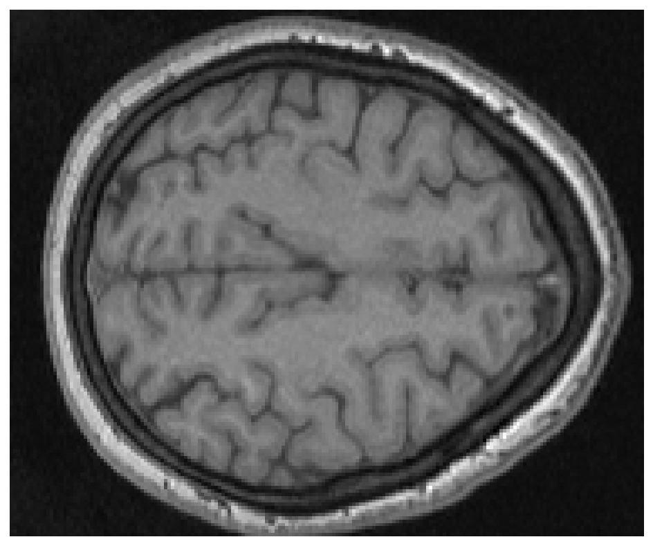
plt.imshow(vol[:,:,50],cmap = 'gray')
plt.axis('off')
plt.show()
Same idea in here. We use subplot methods to visualize some slices through the brain volume.
fig = plt.figure(figsize=[12, 12])
subplot_counter = 1
for i in range (0,67,6):
ax = fig.add_subplot(3, 4, subplot_counter)
plt.imshow(vol[:,:,i],cmap = 'gray')
plt.axis('off')
plt.tight_layout()
subplot_counter += 1
plt.show()

By using Plotly to ‘slice’ the image, we can get interactive ‘brain’
Note
If the following code cannot running on the page, please download the file and run it on your machine
# From: https://plotly.com/python/visualizing-mri-volume-slices/
import time
import numpy as np
from skimage import io
volume = vol.T
r, c = volume[0].shape
# Define frames
import plotly.graph_objects as go
nb_frames = 68
fig = go.Figure(frames=[go.Frame(data=go.Surface(
z=(6.7 - k * 0.1) * np.ones((r, c)),
surfacecolor=np.flipud(volume[67 - k]),
cmin=0, cmax=200
),
name=str(k) # you need to name the frame for the animation to behave properly
)
for k in range(nb_frames)])
# Add data to be displayed before animation starts
fig.add_trace(go.Surface(
z=6.7 * np.ones((r, c)),
surfacecolor=np.flipud(volume[67]),
colorscale='Gray',
cmin=0, cmax=200,
colorbar=dict(thickness=20, ticklen=4)
))
def frame_args(duration):
return {
"frame": {"duration": duration},
"mode": "immediate",
"fromcurrent": True,
"transition": {"duration": duration, "easing": "linear"},
}
sliders = [
{
"pad": {"b": 10, "t": 60},
"len": 0.9,
"x": 0.1,
"y": 0,
"steps": [
{
"args": [[f.name], frame_args(0)],
"label": str(k),
"method": "animate",
}
for k, f in enumerate(fig.frames)
],
}
]
# Layout
fig.update_layout(
title='Slices in volumetric data',
width=600,
height=600,
scene=dict(
zaxis=dict(range=[-0.1, 6.8], autorange=False),
aspectratio=dict(x=1, y=1, z=1),
),
updatemenus = [
{
"buttons": [
{
"args": [None, frame_args(50)],
"label": "▶", # play symbol
"method": "animate",
},
{
"args": [[None], frame_args(0)],
"label": "◼", # pause symbol
"method": "animate",
},
],
"direction": "left",
"pad": {"r": 10, "t": 70},
"type": "buttons",
"x": 0.1,
"y": 0,
}
],
sliders=sliders
)
fig.show()